Request samples
-
Lignapal
Project by
Edition Office
Location
Southbank
Photography
Ben Hosking
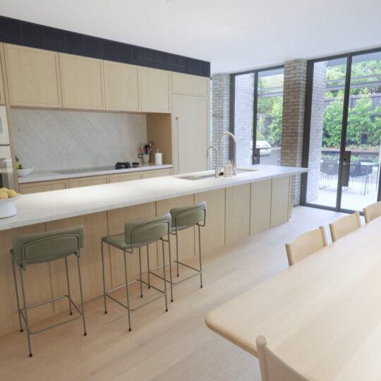
Overlooking Melbourne’s arts precinct and the Royal Botanic Gardens, The Melburnian is an apartment that was in desperate need of intervention. Impersonal, sterile and awkwardly laid-out, the apartment was at odds with its prime location, in which the bustling city and lush surrounds promised a hereto unexplored potential for entertaining, relaxing and creating a dream home. And so the apartment’s young owners approached Melbourne’s Edition Office with a brief to transform their space into its antithesis, where texture, materiality and an open floorplan would create warmth and personalisation.
The original layout of the apartment contained multiple rooms that were compacted into a confusing footprint of small spaces. As a result, the apartment felt cluttered and compressed and did little to capture the endless views that the location provides.
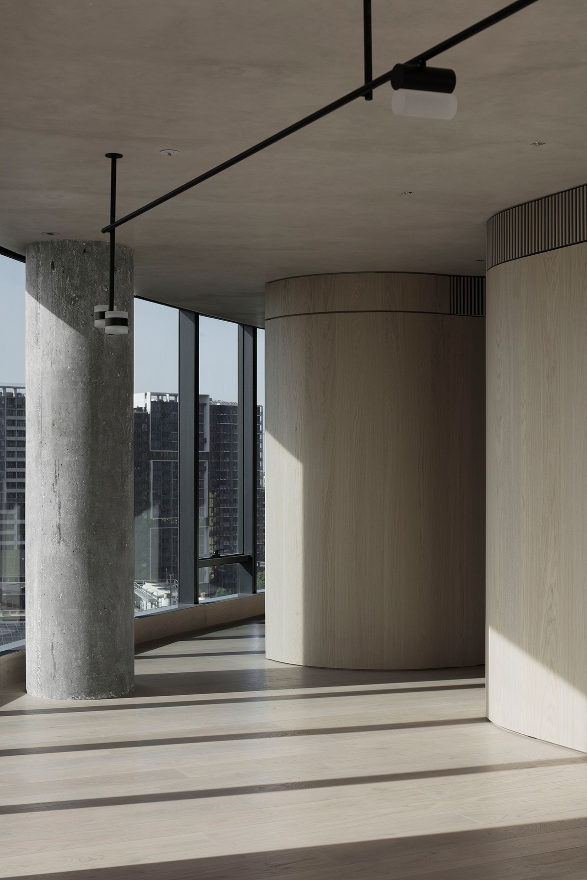
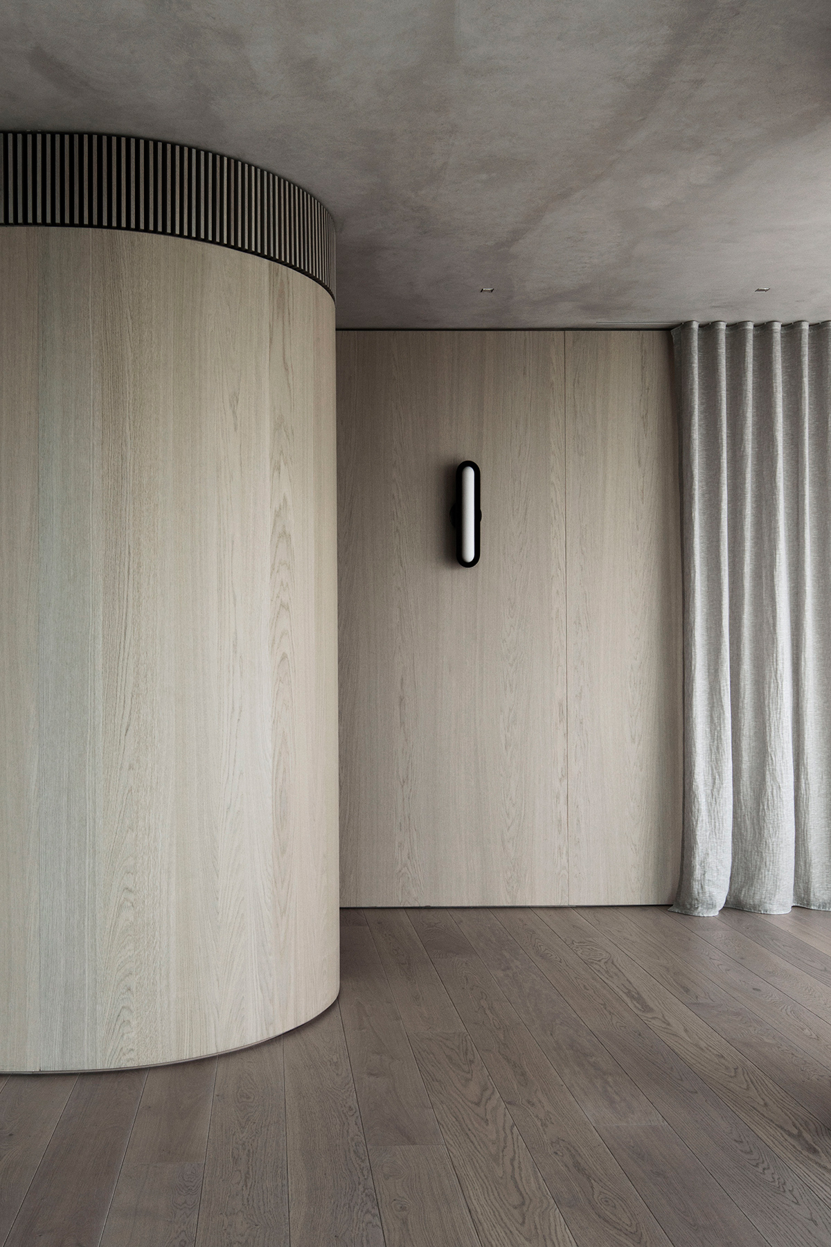
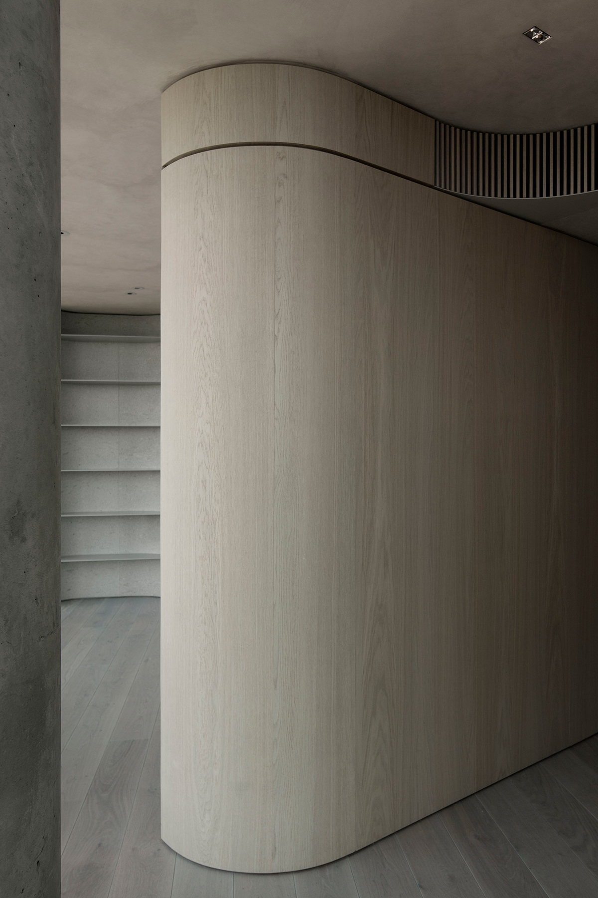
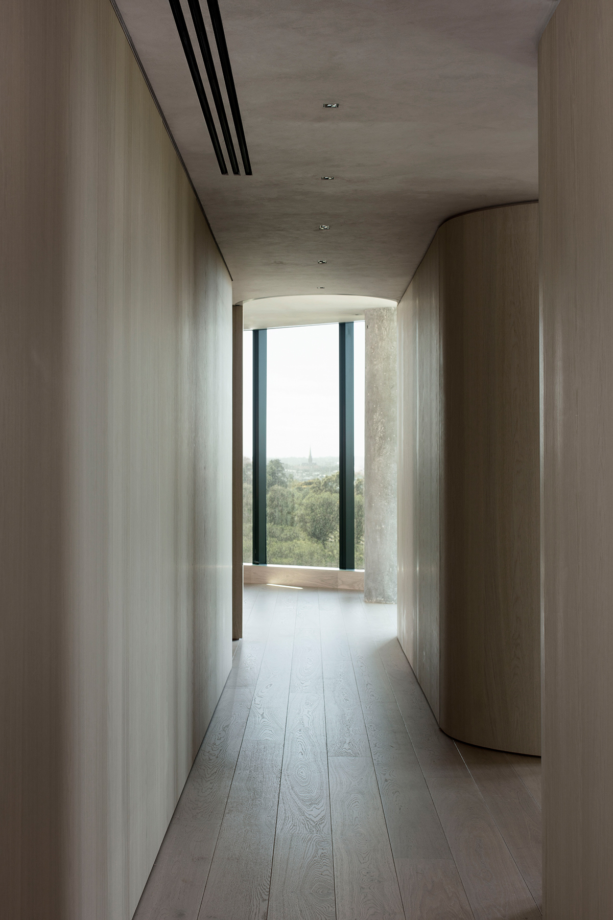
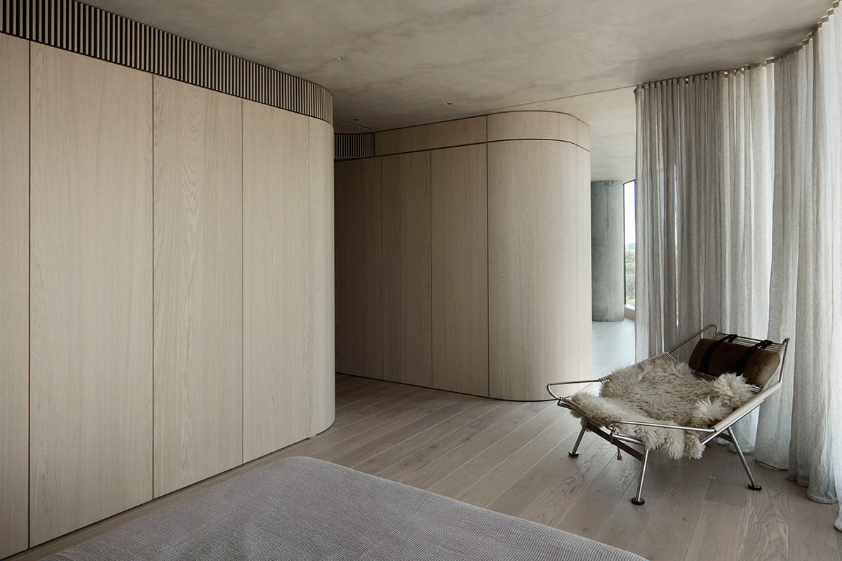
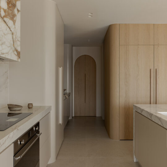
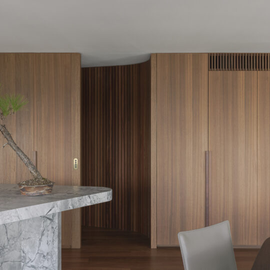
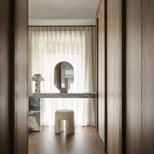
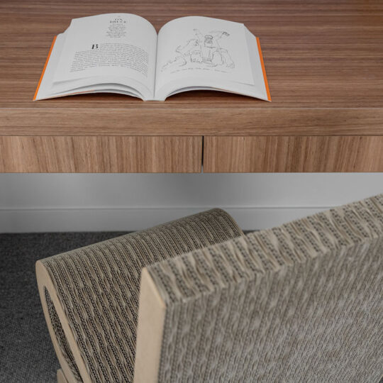
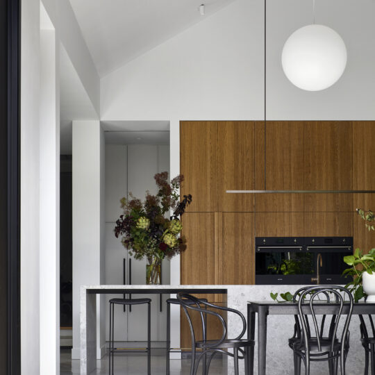
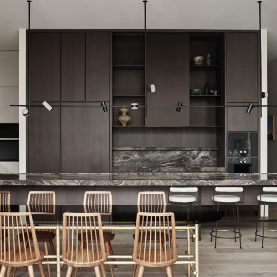
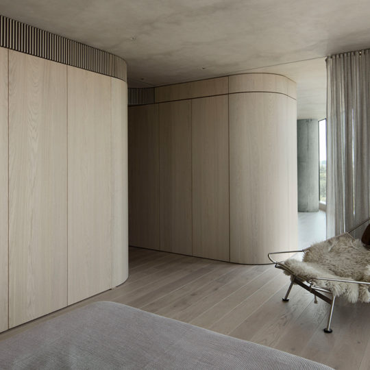
Looking to create a more open and liveable space, the architects removed many of the internal walls, replacing them with a series of serpentine oak partitions that mimic the curvature of the block’s façade. Soft and textural, the lines of the partitions provide a gentle transition from zone to zone, creating private, intimate spaces without the need for doors or closures. The wooden volumes conceal the kitchen, a quasi-library cubicle and a home office, as well as blocking vision to the master bedroom.
The result is an apartment that feels open and welcoming, where spaces flow into each other, creating a kind of effortless continuity that still allows for separation if and when it is required.
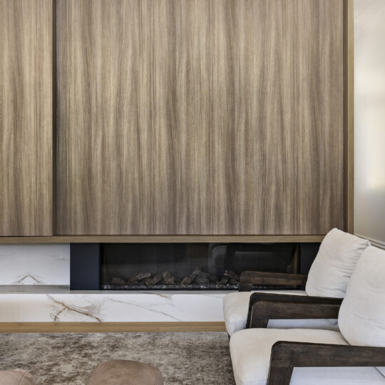
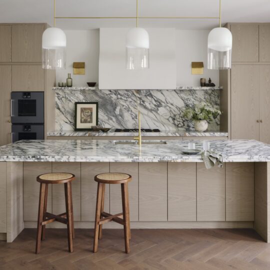
These volumes also work to provide a foundation for the apartment’s new “soul”, where a layered material palette of timber, stone and leather create a warmth that was absent in the space’s previous iteration. Drawing on the circular theme – large, spherical, structural columns that were original to the building are woven into the space’s design, where polished concrete on walls and ceilings soften the presence of the columns by echoing the materiality in a more delicate and finessed finish.
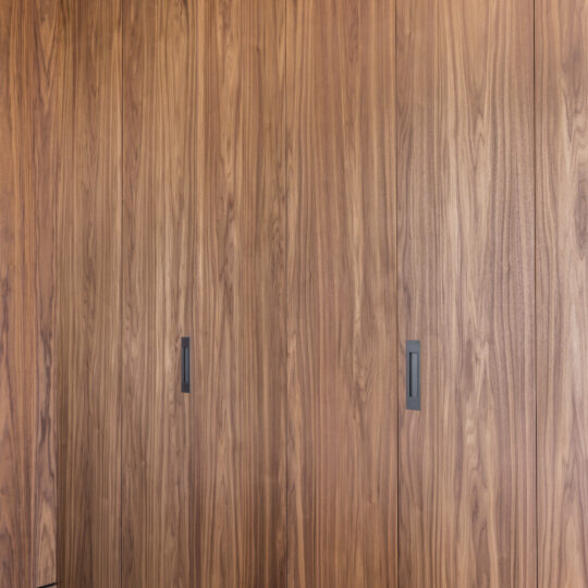
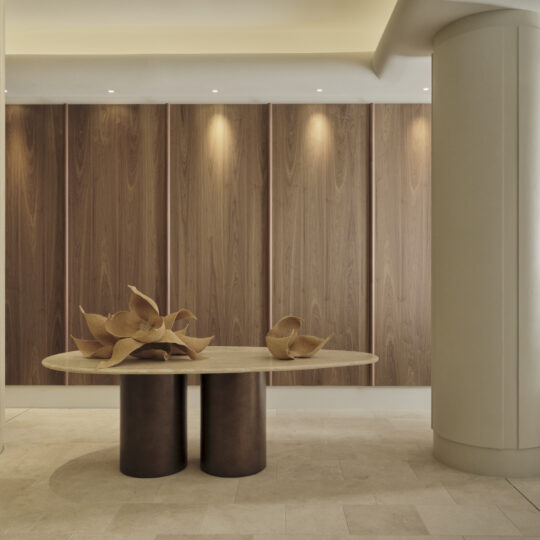
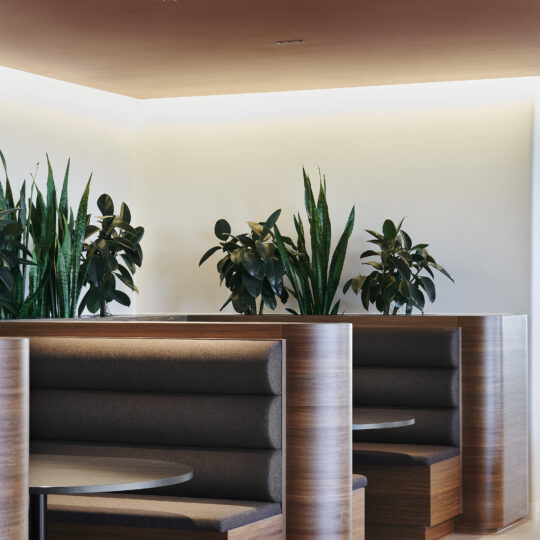
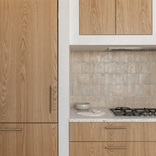
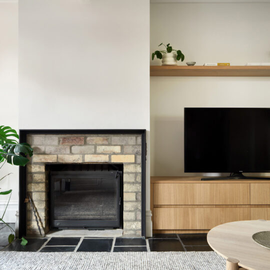
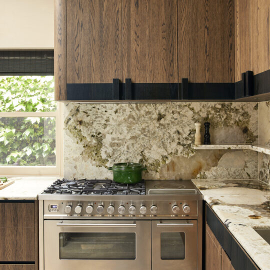
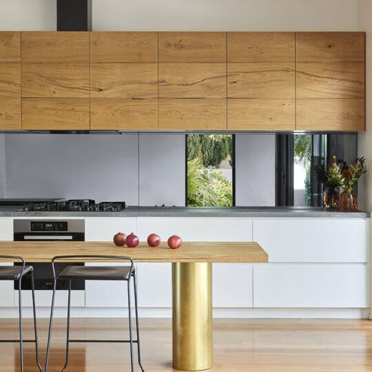
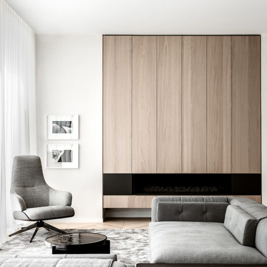
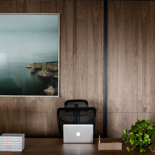
Timber finishes, such as those on the curved walls, were also important in balancing the concrete. Opting for a wooden panel solution, the architects looked to a finish that would complement the material palette of concrete and blonde timbers, without compromising durability or style. They ultimately decided on George Fethers’ Lignapal 163.10 Vibrant Oak Cool White panels, that marry perfectly with the textures of the wooden partitions.
The textural palette of The Melburnian allows for the apartment’s views to be taken in wholly, and for the practical areas to be suitably tucked away. Both architect and George Fethers have worked in collaboration to ultimately create a contemporary apartment that allows for continuum, more space, and the ability to easily separate the moments of hard work and tranquillity.


